

Dieter Schwanznase
Celkem 183 komentářů
23:00:20 10.11.2004
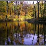
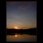
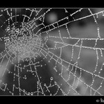
beautiful colours. either more water or more of the trees...
22:58:09 10.11.2004
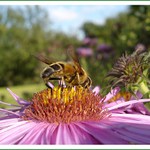
a bee. a flower... the background is not good at all. the angle - bad. Bee in the middle..

22:54:39 10.11.2004
what did you want to take picture of? the sunset or the bug? Like a small helicopter... N

22:39:14 10.11.2004
nice you could have waited more before taking the picture... The trees - i dont know
22:37:25 10.11.2004
not in focus, too small, other angle, actually - other picture
22:36:30 10.11.2004
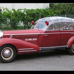
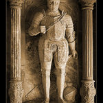
the sword is too bright compared to that guy. It is also pretty grey
22:16:53 10.11.2004
there some petential in it.... could have been done better - dont ask me how ;-)))
22:15:57 10.11.2004
great man!! little too bright but i can imagine that it was not possible to do it in some other way
22:10:00 10.11.2004
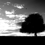
I would imagine more shades. (darker) very nice +++
22:04:26 10.11.2004
Yep, Czech Republic! And I wasnt drunk ;-)
21:51:09 10.11.2004
BV: Das glaub ich dir ;-) kenne bereits paar tschechen. Kann nie schaeden, neue Ecken kennezulernen ;-))
21:39:51 10.11.2004
stefan: it is very simple! simplicity is beautiful. I know it is not perfect I ll keep trying I promise ;-))
21:36:08 10.11.2004
Not really a good think to take picture of. It says nothing at all!!

21:26:52 10.11.2004
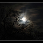
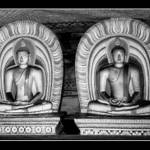
very nice, very scary, very well done

21:23:30 10.11.2004
OK, very nice, be careful - their feets are almost out of the picture
21:20:58 10.11.2004
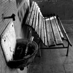
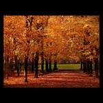
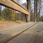
OK, also a bench!! The trees in the back - away!!! The shade at the bottom - no!!! Try it from the other side!!
21:18:42 10.11.2004
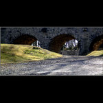
Aint bad, the picture could be devided into three areas. I would prefer less of the bridge, get on your knees and furhter from the bridge..
21:15:40 10.11.2004
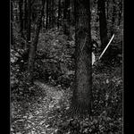
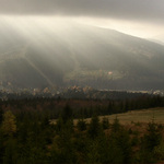
step further - or even better - change the angle of the view. I also thing it is not a good motive at all...
21:06:05 10.11.2004
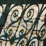
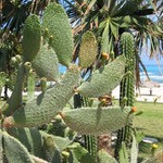
full of plants. no catchpoint for the eye, everything mixed together. Larger!!
20:47:18 10.11.2004
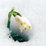
OK, that is something. It is a little pitty that the white is "too white" ;-)
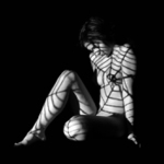
She could have all finger on the picture
She could have all finger on the picture
20:45:34 10.11.2004
quality. head in the bottom right corner... te white is tooo white..